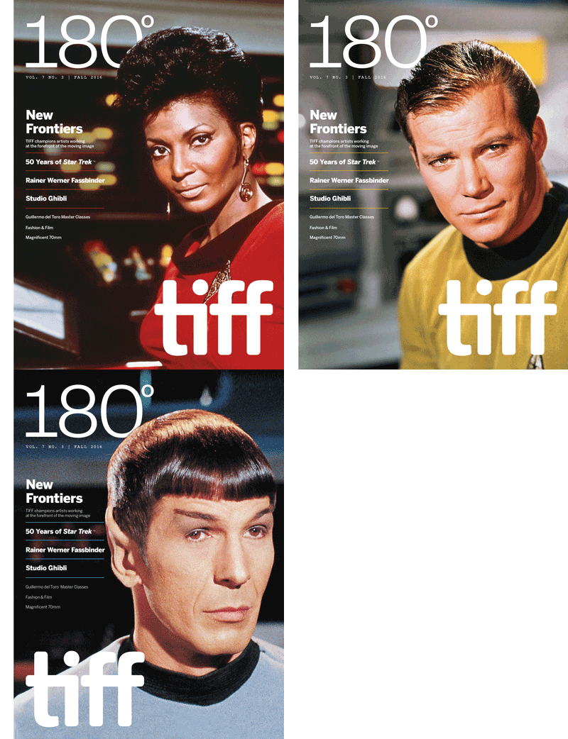
180°
Seasonal magazine for the Toronto arts institution, TIFF
Role: Art Director, Designer, Writer
During my nine years at TIFF, 180° was my perennial favourite project.
Published in print and digital editions three times a year from 2010 until 2020, this magazine was the official guide to all things TIFF — both on and offscreen.

Many people know TIFF only as the Toronto International Film Festival that runs every September, but since 2010, TIFF has operated TIFF Bell Lightbox, a year-round home for the organization complete with cinemas, restaurants, exhibition spaces and a library. 180° was designed to showcase this side of the organization’s activities: its film screenings, exhibitions, and numerous charitable and philanthropic initiatives.
My aim with 180° was to produce the sort of magazine I would want to read, which I always found to be a challenging yet gratifying venture. As I saw it, my role as Art Director was to stay out of the way of the content — to let the images and words do the heavy lifting. With each issue, I found myself in the enviable position of getting to work with enormously talented writers and some of the most iconic visuals ever created.
180° is the sort of lavish printed piece many organizations have shied away from in the past decade, but it is also the sort of piece that can elevate the stature of a venue such as TIFF Bell Lightbox. This was always front of mind for me as the Art Director, and when I and the Managing Editor set out to refresh the magazine’s design shortly after the Lightbox’s fifth anniversary, we were determined to make it reflect the many ways that TIFF had changed and evolved during those five years.
As a guideline for this new approach, we anchored each issue to a specific thematic focus related to the four “pillars” of TIFF's mission: History & Preservation, Community Outreach & Education, Experimentation, and Discovery & Development.
Rather than simply explaining TIFF's various initiatives, we utilized short, digestible articles and interviews to have TIFF staff and audiences tell their stories, shedding light on the lesser-seen corners of the organization. (For example, Reel Comfort, an in-hospital outreach programme which fosters connections between mental health participants and the world of film.)

With this in mind, we proceeded to reconsider the entire magazine from front to back, in terms of both design and content. Traditionally, the role of 180° had been to promote upcoming events and screenings through curatorial essays — content which we certainly wanted to keep — but our goal with this revamp was to lead with a more narrative-based approach.
TIFF does a lot more than put films on screen or guests on stage — the organization believes that film is an inclusive medium that can change lives, spark imaginations and connect communities. Our goal was to better tell that story to our most vocal supporters: our donors and members.
The primary readership of 180° includes TIFF's membership base, and issue by issue, story by story these narratives help those patrons better understand just how big of a difference their membership fees and donations make. For this audience, each issue functions as a sort of year-round Annual Report.
“
Every great film should seem new every time you see it.”
— Roger Ebert
Taking inspiration from the quote above, my goal was that the cover image always be both high-impact and a little surprising. In the magazine's design bible, I tried to crystallize my mindset:
An iconic image is not necessarily the best choice. If you elect to use an iconic image, use it in an unexpected way. TIFF's audience is sophisticated and savvy. Our audience is as well versed in the visual history of film as those of us putting the magazine together. Imagine a reader opening their mailbox and receiving the new issue. Our desired reaction is not "They’re playing Breathless again," but rather "Oh wow, I haven’t seen Breathless in forever!"

 |  |  |
|---|---|---|
 |
This ethos carried over into the feature well of the magazine, where the bulk of each issue was still dedicated to TIFF's film programmes — selections of films curated around an actor, filmmaker, genre or motif. Each of these programmes carried a unique personality which we wanted to convey on the first spread of each section — what we called the “splash” pages. For myself and the magazine's designers, these splash pages were an opportunity to play. Our goal was to provide each programme with a distinct personality while working within the parameters of the magazine's style.
After the splash, the subsequent spreads of each section relied on a flexible style sheet for the pages detailing the individual films. Though we would source images for each film, in keeping with our high-impact ethos each spread only utilized two to four images — again trying to strike a balance between instantly recognizable images and surprising takes on old favourites.
Back in 2012 I had also begun producing a digital version of 180° for mobile devices, tablets and web.
Previously, this digital version was available only to Members through a paywall, but with our overhaul of the magazine we wanted to reach as many readers as possible, so we removed the paywall and created an archive of all the back issues.

Based in HTML5, this interactive version optimizes the print experience with exclusive video and audio content, and (my personal favourite) an “Add to Calendar” button for users to add events and screenings to their personal agenda.
View the full archive at tiff.net →


